Widget Appearance
Match the chat widget to your brand. Settings live in the Customization tab of an assistant; everything is shown in a live preview before you save.
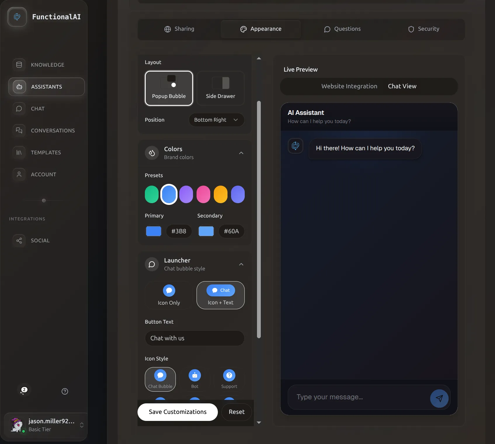 Customization tab with live preview. Settings on the left, the actual rendered widget on the right.
Where to Find It
- Assistants in the sidebar
- Manage Assistant on the assistant card
- Customization tab
What You Can Customize
The widget intentionally exposes a small set of high-leverage settings — everything else is derived (e.g., launcher background tracks the primary color) so the widget stays visually coherent.
| Group | Setting | Notes |
|---|---|---|
| Theme | Light / Dark | Affects message and surface colors |
| Layout | Popup bubble / Side drawer | Drawer is desktop-optimized |
| Layout | Position | Popup: bottom-right or bottom-left. Drawer: right or left |
| Layout | Window size | compact (380×550), standard (420×700), large (480×800). Optional pixel overrides |
| Launcher | Style | icon-only or icon-with-text |
| Launcher | Icon | Pick from a curated set (see below) |
| Launcher | Text | Shown next to icon when style is icon-with-text |
| Launcher | Drawer tab text | Only for the drawer layout |
| Colors | Primary, Secondary | Used everywhere — buttons, accents, launcher, send button |
| Header | Title, Subtitle, Welcome message | Plain text; welcome supports **bold** |
| Avatars | Show assistant avatar | Toggle. Avatar image itself is set in Basic Settings |
| Mobile | Show on mobile | Hide the launcher on phones if you have a separate mobile flow |
| Behavior | Human handoff | Adds a "Speak to Human" button to the header that pauses AI replies |
Theme
Two presets. Switching theme resets the color presets to match — if you've already customized primary/secondary, the dashboard asks before overwriting them.
- Light — white surfaces, dark text. Default for marketing and storefront sites.
- Dark — deep slate surfaces, light text. Default for dashboards and dev tools.
Colors
Two colors drive the entire widget palette: Primary and Secondary. The launcher background, send button, message accents, and gradient endings are all derived from these two.
Presets
Six brand-safe presets are available in the picker:
| Preset | Primary | Secondary |
|---|---|---|
| Cyan | #06B6D4 |
#22D3EE |
| Emerald | #10B981 |
#34D399 |
| Blue | #3B82F6 |
#60A5FA |
| Violet | #8B5CF6 |
#A78BFA |
| Rose | #EC4899 |
#F472B6 |
| Amber | #F59E0B |
#FBBF24 |
Custom
Use the color picker (or paste a hex value) for either Primary or Secondary. Tip: for harmony, set Secondary to a slightly lighter or more saturated variant of Primary — the presets above are a useful template.
Layout
Popup Bubble (default)
A floating launcher button anchored to a corner. Clicking opens a chat window above it.
- Position:
bottom-right(the conventional spot) orbottom-left - Window size:
compact,standard, orlarge— or set customwindowWidth/windowHeightto override the preset - Mobile: the chat goes full-screen automatically regardless of size setting
Side Drawer
A persistent tab on the side of the page. Clicking opens a full-height drawer.
- Side:
rightorleft - Tab text: the label shown on the persistent tab (defaults to "Chat")
- Drawer width: quarter (25%), about-a-third (35%), or half (50%) of screen width — or set a custom percentage
- Mobile: drawers always go full-screen on phones
Drawers work well for documentation sites, dashboards, and SaaS apps where the visitor benefits from a persistent affordance and more screen real estate.
Launcher
Icon
Pick a launcher icon from the curated set. Icons are grouped by intent:
| Group | Icons |
|---|---|
| Conversation | Chat (default), Message, Replies |
| Assistant | Sparkles, Wand, Spark, Bot |
| Support | Support, Help, FAQ |
| Commerce | Shop, Store, Orders |
| Minimal | Dot |
The launcher background always matches your Primary color — there is no separate "launcher color" setting, intentionally, so the widget never drifts away from the rest of your palette.
Style
- Icon only — just the icon. Best for minimal designs and mobile-first sites.
- Icon + text — icon plus a short label like "Chat with us". Better for first-time engagement.
Text
Free-form short label shown next to the icon when style is icon-with-text. Keep it 2–4 words ("Chat with us", "Need help?", "Ask AI").
Header
Three text fields, all plain text:
- Title — main heading. Default "AI Assistant". Examples: store name, assistant persona name.
- Subtitle — secondary line under the title. Default "How can I help you today?".
- Welcome message — first message shown in the chat surface. Supports
**bold**formatting.
Keep these short — long headers eat into chat space.
Avatars
- Show assistant avatar — toggles whether the AI's avatar appears next to its messages. On by default.
- The avatar image itself is set in the assistant's Basic Settings, not here.
User-message avatars are not currently shown — the widget is designed around an asymmetric pattern (avatar on the AI side only) to keep visual focus on the assistant.
Behavior
- Show on mobile — when off, the launcher is hidden on phones. Useful if you have a separate mobile chat flow or just don't want the widget to compete with your mobile checkout.
- Human handoff — adds a "Speak to Human" button to the chat header. When clicked, AI replies pause for that thread and you can take over manually from the Conversations page.
Saving Changes
Click Save Customizations at the bottom of the form. Changes propagate to live deployments within ~30 seconds. Visitors with the widget already open may need to refresh.
Test before you ship
Use the live preview to send a few sample messages with your final palette and copy. Color choices that look fine in the picker can be hard to read in actual messages.
Common Patterns
E-commerce Store
- Theme: Light
- Layout: Popup, bottom-right
- Colors: Brand primary (the Emerald/Blue/Cyan presets are a safe start)
- Launcher: Icon + text — "Chat with us" or "Need help?"
- Header: Store name as title, "Find your perfect product" as subtitle
Documentation / SaaS
- Theme: Dark
- Layout: Drawer, right
- Drawer width: 35% (about a third)
- Colors: Match your dashboard accent
- Launcher tab text: "Help" or "Support"
Minimal / Editorial
- Theme: Light
- Layout: Popup
- Launcher: Icon only, Dot icon
- Colors: A single muted brand primary
Troubleshooting
Changes aren't showing up on the live site
- You clicked Save Customizations (preview alone doesn't save)
- Wait ~30 seconds for propagation
- Hard refresh the page (Cmd/Ctrl + Shift + R)
- Clear browser cache or test in incognito
The launcher overlaps another widget
The widget always anchors to a screen corner — there's no offset setting. Options:
- Change Position from
bottom-righttobottom-left(or vice-versa) - Switch to the Drawer layout, which uses a side tab instead of a corner button
- Hide the launcher on mobile (
Show on mobileoff) if the conflict is mobile-only
Colors look different on my site than in preview
The preview renders the widget as-is, but page CSS can occasionally bleed in. Open browser DevTools on your live site and check whether any global styles target the widget container — the embed isolates most styles via Shadow DOM, but heavy global resets can still affect the launcher button.