Widget Appearance
Customize your chatbot widget to perfectly match your brand and website design.
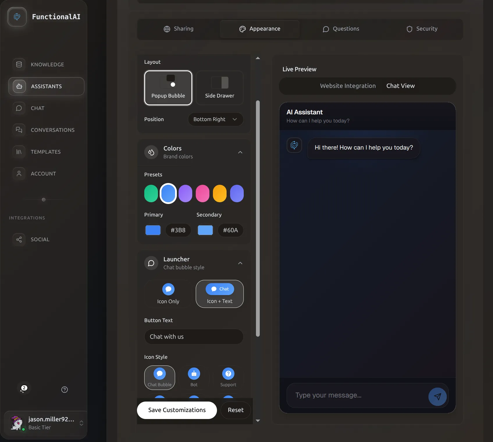 The Appearance tab with live preview lets you customize colors, layout, and launcher style.
Overview
The appearance settings control how your chat widget looks when deployed on websites. All changes are shown in a real-time preview so you can see exactly how your widget will look before deploying.
Access Appearance Settings
- Go to Assistants in the sidebar
- Click Manage Assistant on your assistant card
- Select the Customization tab
- Appearance settings appear on the left, live preview on the right
Theme Selection
Choose between light and dark themes as your base starting point.
Light Theme
Best for bright, professional websites. Features:
- White/light gray backgrounds
- Dark text for readability
- Subtle shadows and borders
- Clean, minimal aesthetic
Ideal for: Corporate sites, documentation, healthcare, education
Dark Theme
Modern, elegant appearance. Features:
- Dark slate/navy backgrounds
- Light text and accents
- Glowing effects on interactive elements
- Contemporary feel
Ideal for: Tech products, gaming, creative agencies, modern SaaS
Theme Changes Reset Colors
Switching themes resets background and message colors to match the new theme. Primary/secondary colors are preserved.
Color Customization
Primary Color
The main accent color throughout your widget. Used for:
- Send button background
- User message bubbles (in gradient mode)
- Interactive element highlights
- Header accents
- Links and buttons
Choosing your primary color:
- Use your brand's primary color for consistency
- Ensure good contrast with backgrounds
- Test readability on both light and dark surfaces
Color presets available: Blue, Purple, Green, Orange, Pink, Indigo
Secondary Color
Supporting accent color. Used for:
- Gradient endings (when gradients enabled)
- Hover states
- Secondary buttons
- Subtle accents
Tip: Choose a lighter or darker shade of your primary color for harmonious design.
Background Gradient
Create depth with a two-color background gradient.
- Background From (bgFrom)
- Top/start color of the gradient
- Background To (bgTo)
- Bottom/end color of the gradient
Popular Gradient Combinations
Light Theme:
- Clean White:
#FFFFFF→#F8FAFC(subtle gray) - Warm:
#FFFFFF→#FEF3C7(cream) - Cool:
#F0F9FF→#FFFFFF(light blue to white)
Dark Theme:
- Deep Navy:
#0F172A→#1E293B - Purple Haze:
#1E1B4B→#312E81 - Forest:
#064E3B→#065F46
Assistant Message Background
Background color for AI responses. Separate from the main background to create visual distinction.
Light theme defaults: Light gray (#F8FAFC)
Dark theme defaults: Medium gray (#374151)
Best practice: Choose a color that contrasts with the main background but isn't jarring. Subtle differences work best.
Layout Type
Choose how your widget appears on the page.
Popup Bubble (Default)
Classic floating chat widget.
Behavior:
- Launcher button in corner of screen
- Clicking opens a popup window above the button
- Window "floats" over page content
- Can be minimized back to button
Best for: Most websites, e-commerce, landing pages, blogs
Advantages:
- Familiar pattern users recognize
- Doesn't interfere with page content
- Easy to dismiss
- Works great on mobile
Side Drawer
Widget slides in from the side of the screen.
Behavior:
- Tab visible on edge of screen
- Clicking opens full-height panel
- Slides over content (or pushes it aside)
- More screen real estate for conversation
Best for: Dashboard apps, documentation sites, SaaS platforms
Advantages:
- More space for longer conversations
- Professional appearance
- Good for complex interactions
- Desktop-optimized experience
Configuration options:
- Drawer Side: Right or Left
- Tab Text: Customizable label (e.g., "Chat", "Support", "Help")
Launcher Customization
The button that opens your chat widget.
Launcher Position
Choose which corner of the screen:
- Bottom Right (most common - traditional chat position)
- Bottom Left
- Top Right
- Top Left
Offset
Fine-tune the launcher's exact position with offset values.
- Offset X: Distance from left/right edge (default:
20px) - Offset Y: Distance from top/bottom edge (default:
20px)
Use cases:
- Avoid overlapping other widgets (live chat, help desk)
- Account for fixed navigation bars
- Adjust for mobile optimization
- Custom positioning for specific designs
Launcher Size
Controls the diameter of the launcher button (default: 60px)
Recommendations:
- Small (
50px): Subtle, minimal footprint - Medium (
60px): Balanced, standard size - Large (
70-80px): High visibility, accessibility-friendly
Launcher Icon
Choose from several professional icons:
| Icon | Best For |
|---|---|
| Chat | General messaging, casual tone |
| Bot | AI assistants, automation |
| Support | Customer service, help desks |
| Sparkles | Creative, magical experiences |
| Robot | Tech products, AI features |
| Brain | Smart assistants, knowledge bases |
Launcher Style
Two display modes:
Icon Only
Just the icon, no text. Clean and minimal.
Best for:
- Mobile-first designs
- Minimalist aesthetics
- International audiences (no text to translate)
- When space is limited
Icon with Text
Icon plus custom text label (e.g., "Chat with us", "Need help?", "Ask AI")
Best for:
- Encouraging first-time engagement
- Clear call-to-action
- Desktop-heavy audiences
- When you want to communicate purpose
Text customization (Launcher Text field):
- Keep it short: 2-4 words ideal
- Action-oriented: "Chat now", "Get help"
- Friendly tone: "Hi! Chat with us"
- Match your brand voice
Launcher Colors
- Background Color (launcherBgColor)
- Color of the launcher button itself. Default matches your primary color.
- Text Color (launcherTextColor)
- Color of icon and text on launcher. Default is white (
#FFFFFF).
Launcher Animation
Subtle pulse animation to draw attention (enabled by default).
When enabled: Gentle scale animation on launcher button When to disable: Minimalist designs, accessibility concerns, professional/formal contexts
Window Dimensions
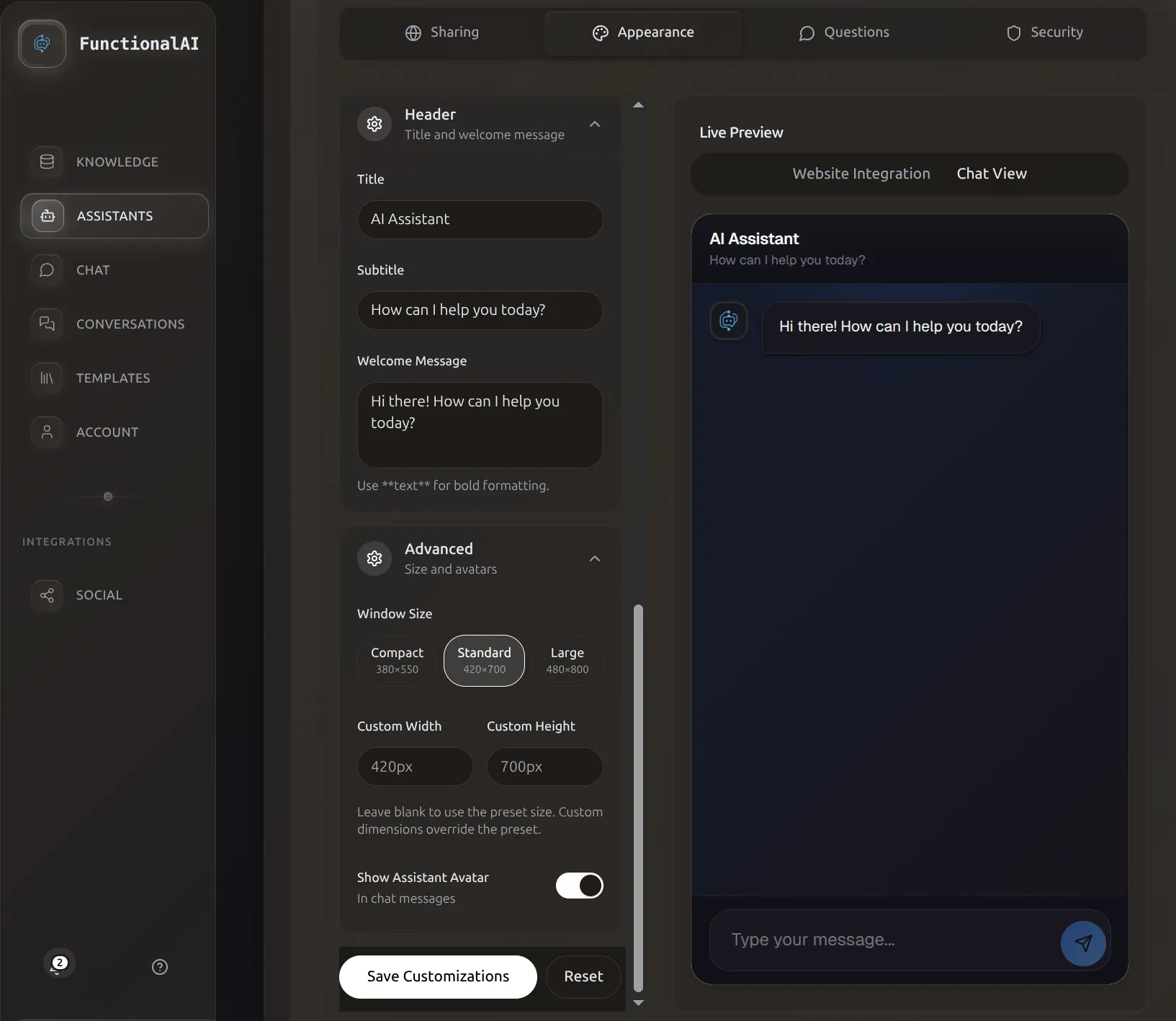 Advanced settings let you fine-tune window dimensions and avatar display options.
Customize the size of the chat window.
Window Width
Width of the chat interface (default: 440px)
Guidelines:
- Narrow (
350-400px): Mobile-optimized, compact - Standard (
420-460px): Most common, balanced - Wide (
480-550px): Desktop-focused, spacious
Mobile Behavior
On mobile devices, the window automatically expands to full-screen regardless of this setting.
Window Height
Height of the chat interface (default: 800px)
Guidelines:
- Short (
500-600px): Above-the-fold, quick interactions - Standard (
700-800px): Full conversations, good balance - Tall (
850-950px): Maximum context, desktop displays
Window Border Radius
Roundness of the window corners (default: 16px)
Options:
- Sharp (
0-4px): Modern, geometric, technical - Rounded (
8-16px): Friendly, approachable, standard - Very Round (
20-28px): Playful, modern, iOS-style
Header Customization
The top section of the chat window.
Header Title
Main heading at the top (default: "AI Assistant")
Examples:
- Your company name: "Acme Support"
- Assistant name: "Maya, your style guide"
- Functional: "How can we help?"
- Playful: "Hey there!"
Header Subtitle
Secondary text below the title (default: "How can I help you today?")
Examples:
- Welcoming: "We're here to help!"
- Functional: "Ask me anything about our products"
- Availability: "Online now - Average response: instant"
- Empty: Leave blank for minimal header
Keep It Brief
1-8 words for title, 2-10 words for subtitle. Long headers take up valuable chat space.
Message Styling
Customize the appearance of chat messages.
User Message Background Style
How user messages are styled:
Gradient
Smooth gradient using primary and secondary colors.
Effect: Modern, dynamic, eye-catching Best for: Contemporary brands, tech products
Solid
Single color (primary color).
Effect: Clean, simple, classic Best for: Professional services, minimal designs
Message Border Radius
Roundness of message bubble corners (default: 18px)
Options:
- Sharp (
4-8px): Technical, modern - Rounded (
12-18px): Friendly, standard messaging - Pills (
24-32px): iMessage-style, playful
Message Avatars
Show or hide avatar images next to messages.
Display User Avatar
Show an avatar next to user messages (default: disabled)
When to enable:
- Personalized experiences
- When user identity matters
- Community-style interactions
When to disable:
- Anonymous interactions
- Minimal design
- Save vertical space
Display Assistant Avatar
Show an avatar next to AI responses (default: enabled)
When to enable (recommended):
- Humanizes the AI
- Clear visual distinction
- Professional appearance
- Reinforces brand identity
When to disable:
- Extremely minimal design
- Want to de-emphasize AI nature
- Very narrow windows
Avatar Images
Avatar images themselves are configured in the Basic Settings tab, not Customization.
Input Field Styling
Customize the message input area at the bottom.
Input Placeholder
Placeholder text shown in empty input field (default: "Type your message...")
Examples:
- Standard: "Type your message..."
- Action: "Ask me anything!"
- Specific: "Describe what you're looking for"
- Friendly: "What's on your mind?"
Send Button Style
Style of the send button:
Gradient
Gradient using primary and secondary colors.
Effect: Modern, dynamic, attention-grabbing Matches: Gradient user messages
Solid
Single color (primary).
Effect: Clean, classic, professional Matches: Solid user messages
Animations
Enable or disable animated transitions and effects.
When enabled (default):
- Smooth message appearances
- Slide-in effects
- Fade transitions
- Button hover effects
When to disable:
- Accessibility requirements (motion sensitivity)
- Performance on low-end devices
- Minimal/serious contexts
Common Design Patterns
E-commerce Store
Theme: Light
Primary Color: Brand color (e.g., #10B981)
Layout: Popup Bubble
Position: Bottom Right
Launcher Style: Icon with Text ("Shop with us")
Window Size: 440px × 800px
Header: Store name + "Find your perfect product"
SaaS Dashboard
Theme: Dark
Primary Color: Product brand color
Layout: Side Drawer (Right)
Position: Top Right tab
Launcher Style: Icon only
Window Size: 500px × full height
Header: "Help & Support"
Professional Services
Theme: Light
Primary Color: Conservative blue (#3B82F6)
Layout: Popup Bubble
Launcher Style: Icon with Text ("Get in touch")
Message Style: Solid colors
Border Radius: 12px (slightly rounded)
Animations: Enabled
Creative Agency
Theme: Dark
Primary Color: Bold accent (#EC4899 pink)
Layout: Popup Bubble
Launcher Style: Icon with Text ("Let's create")
Message Style: Gradient
Border Radius: 24px (very rounded)
Animations: Enabled
Saving Changes
Changes are saved automatically as you make them, but they're only applied locally to your preview.
To Apply Changes
- Review all settings in the preview
- Click Save Customizations button at the bottom
- Changes propagate to all deployments within seconds
Propagation Time
Changes take 5-30 seconds to appear on live websites. Users may need to refresh their browser to see updates.
Widget Preview
Here's how the widget appears to your customers:
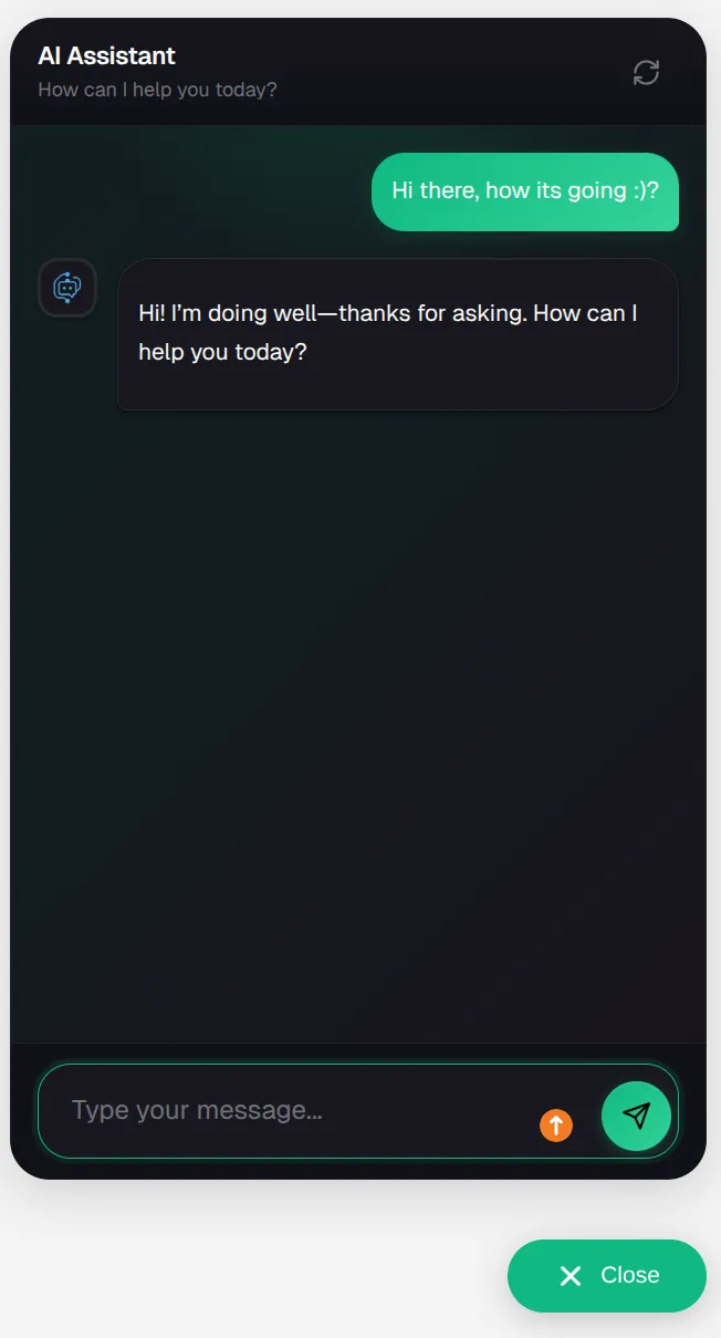 The chat widget provides a clean, professional interface for customer conversations.
Best Practices
Design Consistency
Do:
- Match your website's color scheme
- Use consistent border radius values
- Keep similar spacing throughout
- Test on your actual website
Don't:
- Mix wildly different colors
- Use hard-to-read color combinations
- Over-customize every detail
- Ignore mobile experience
Color Accessibility
Use tools to check color contrast:
- WCAG AA minimum: 4.5:1 contrast ratio for text
- WCAG AAA preferred: 7:1 contrast ratio
Branding
Strong branding approach:
- Use exact brand colors (hex codes from brand guidelines)
- Upload brand logo as assistant avatar
- Use brand voice in header text
- Match your website's design language
Troubleshooting
Colors look different on my website
Possible causes:
- Your website has CSS that affects the widget
- Different color profiles/monitor calibration
- Browser rendering differences
Solutions:
- Test in multiple browsers
- Use exact hex codes from brand guidelines
- Check for CSS conflicts (open browser dev tools)
- Test in incognito mode
Widget is too small on mobile
Widget automatically goes full-screen on mobile. If it's not:
- Check your website's viewport meta tag
- Verify no CSS is overriding widget styles
- Test on real device, not just browser emulation
Changes aren't showing up
Solutions:
- Click "Save Customizations" button
- Wait 30 seconds for propagation
- Hard refresh your website (Ctrl+Shift+R or Cmd+Shift+R)
- Clear browser cache
- Check browser console for errors
Launcher overlaps my other widgets
Solutions:
- Adjust Offset X/Y to move it
- Change Position (e.g., bottom-left instead of bottom-right)
- Make launcher smaller
- Use Side Drawer layout instead
Next Steps
- Share your customized assistant - Get embed code for your website
- Configure security settings - Add pre-chat forms or identity verification
- Set up suggested questions - Guide users to ask the right questions